TCHO
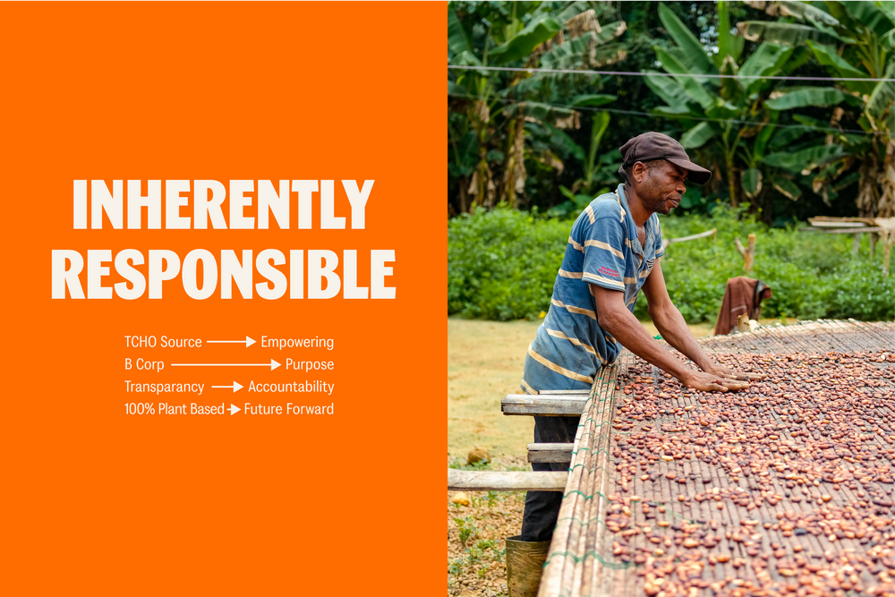
TCHO radically transformed their business to become a Certified B Corp, go 100% plant-based, and create all new flavors for their beloved bars. Their dedication to creating a whole new TCHO needed a whole new brand identity worthy of their altrustic mission while keeping things light and fun. It’s just chocolate after all.
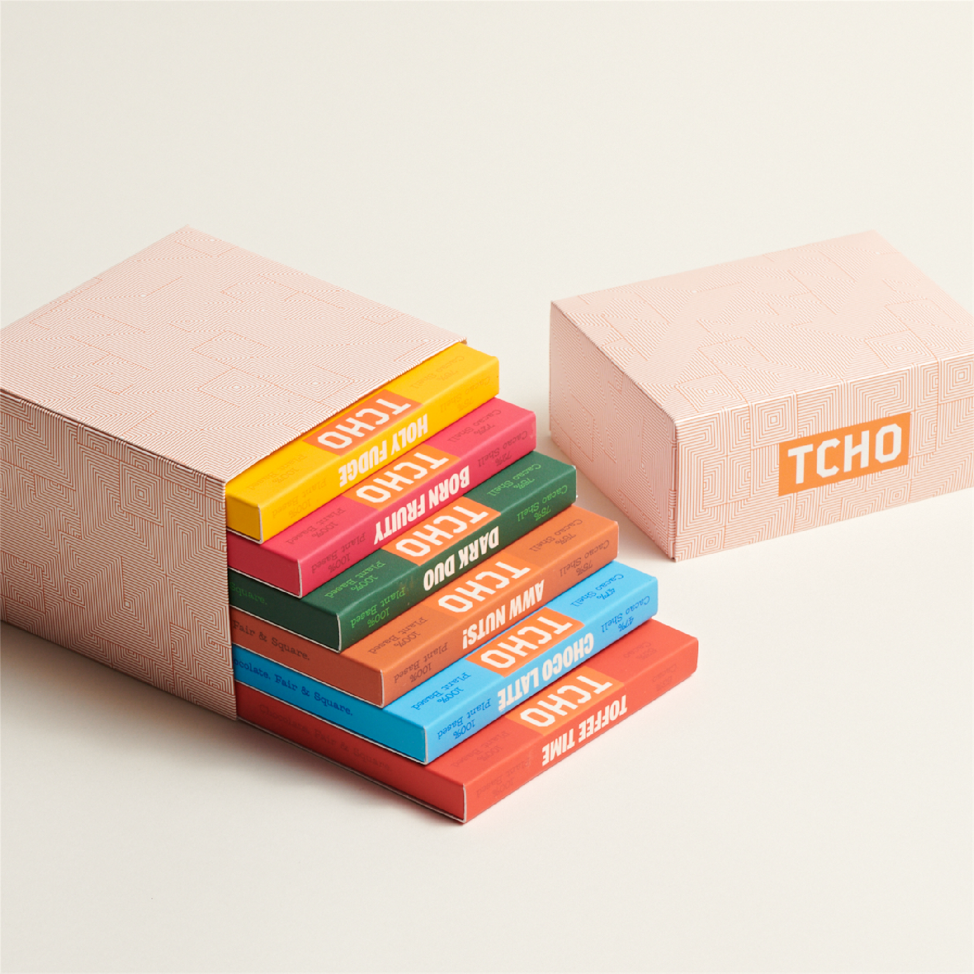
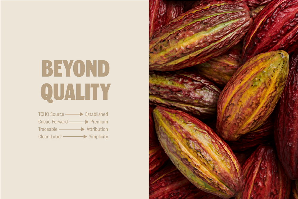
For a company that was doing so many things right, they’d had a difficult time capturing the richness of their story. Armed with the brand’s history and inspired by their dedication to their values, we created a strategic platform to tell their story and empower them as they hit the market with a new tagline. ‘Chocolate. Fair & Square.’ — which became a central idea for the brand, succinctly capturing both the product itself and the brand values in just four words.


Brand Guidelines & Toolkit:
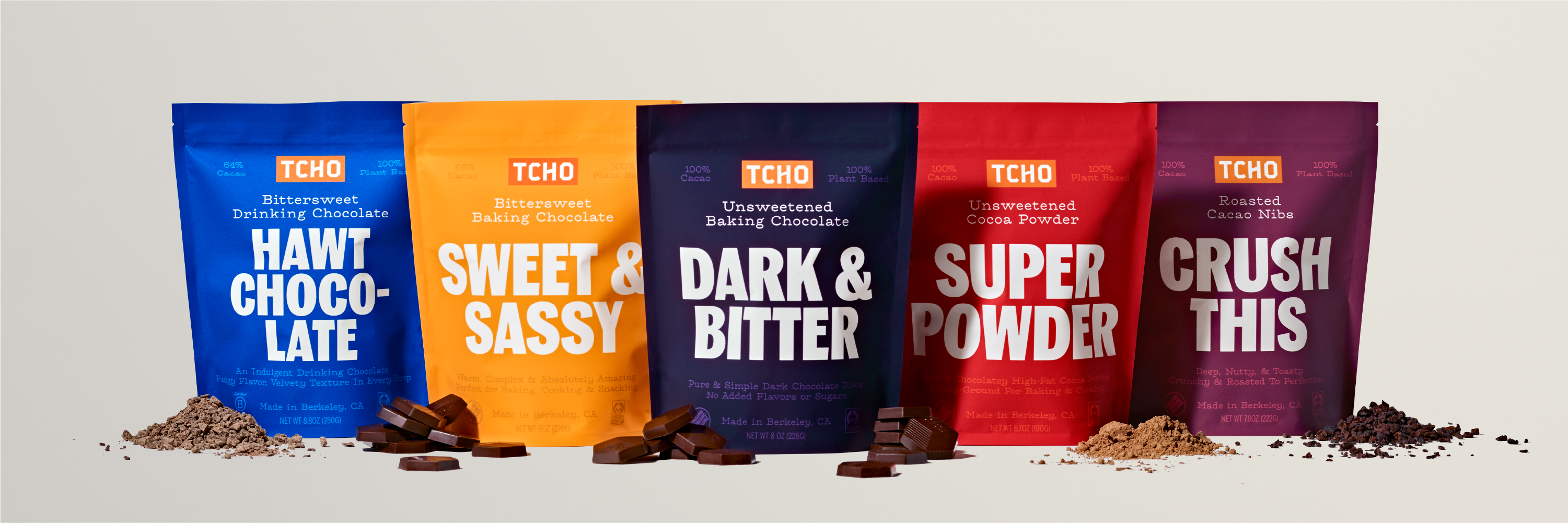
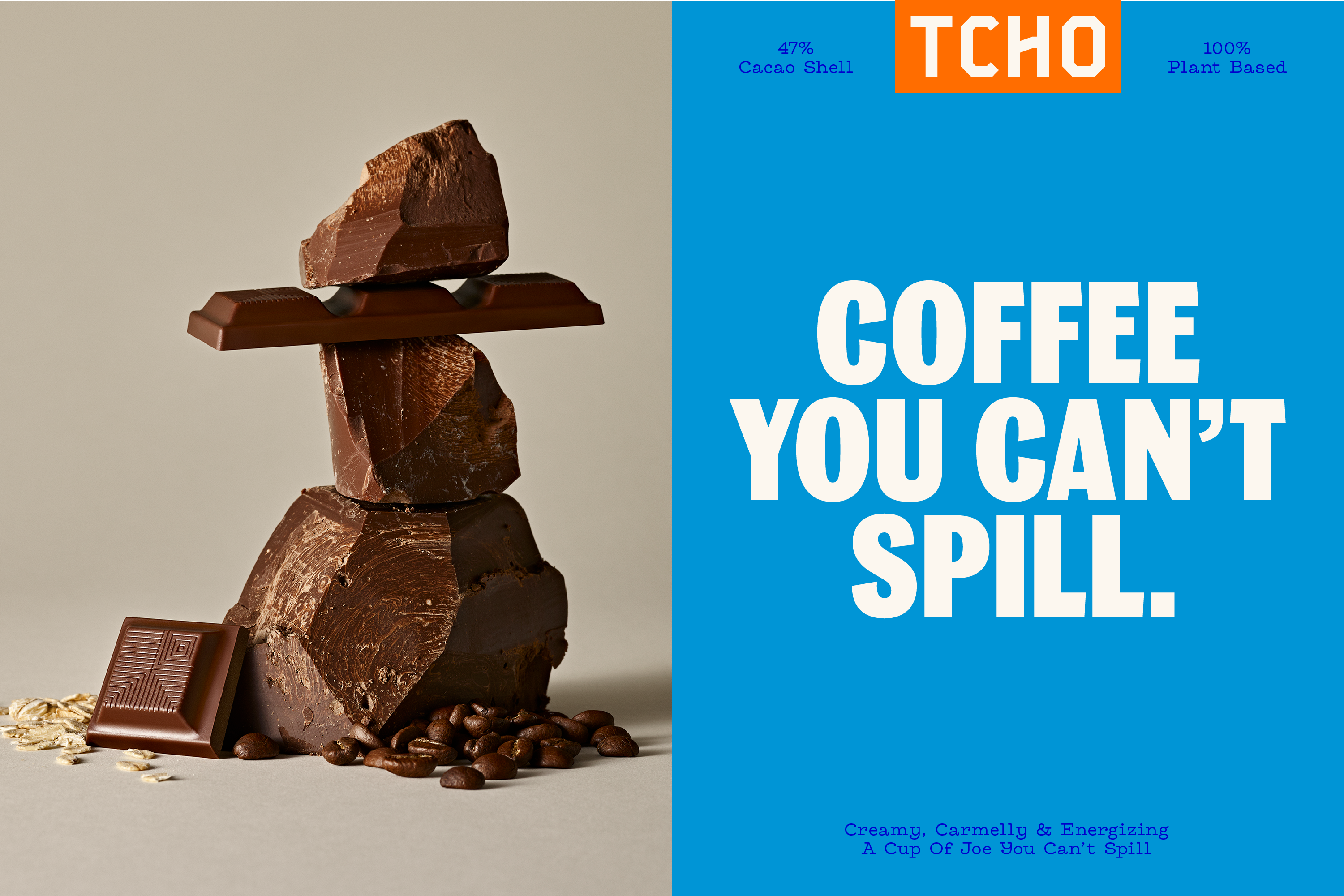
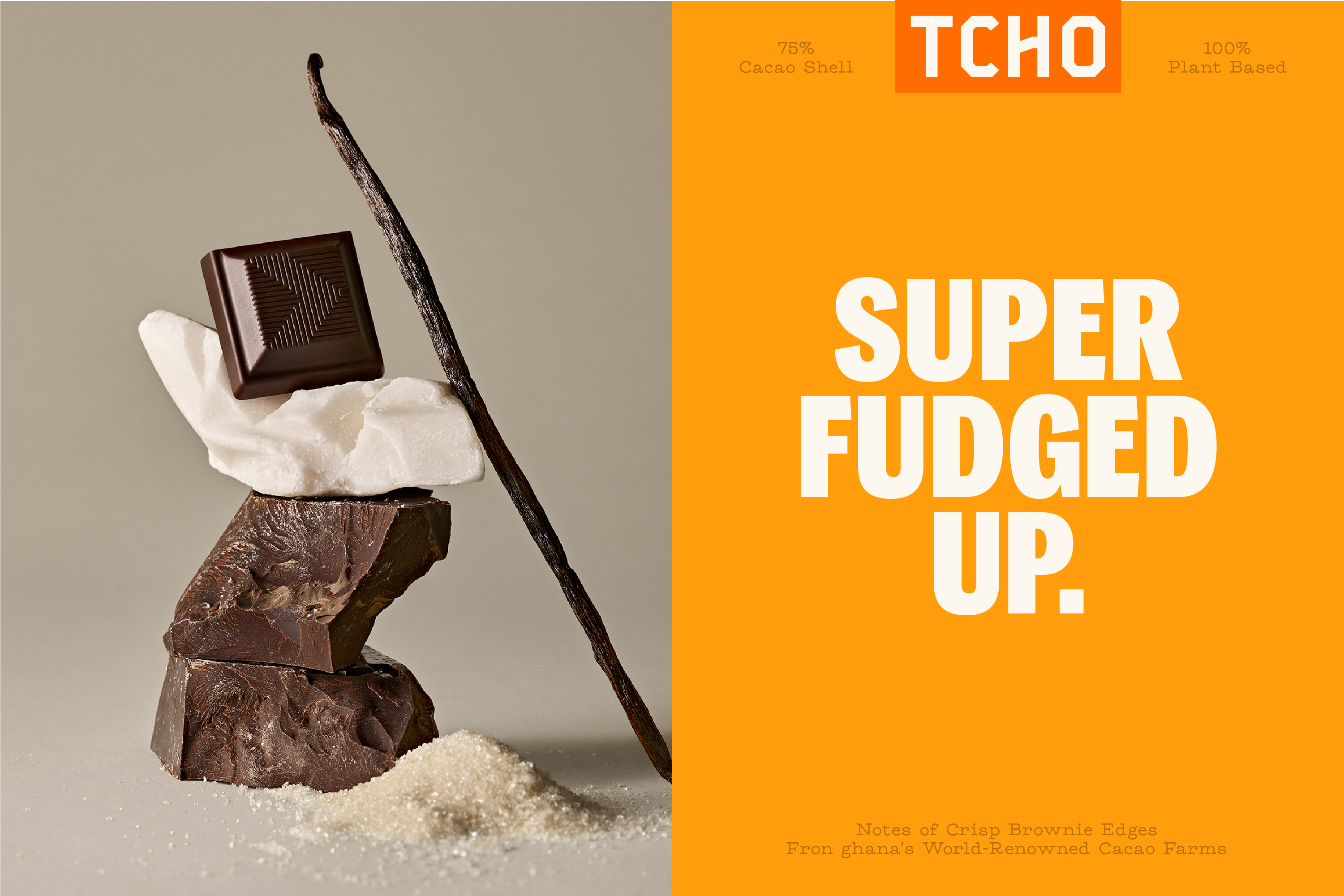
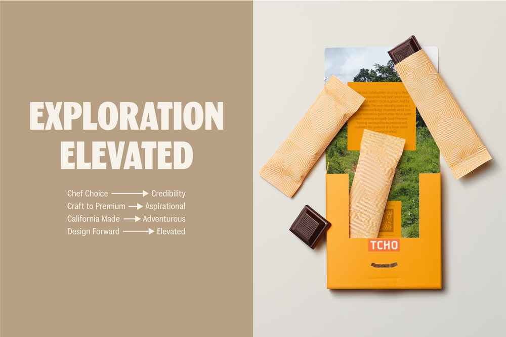
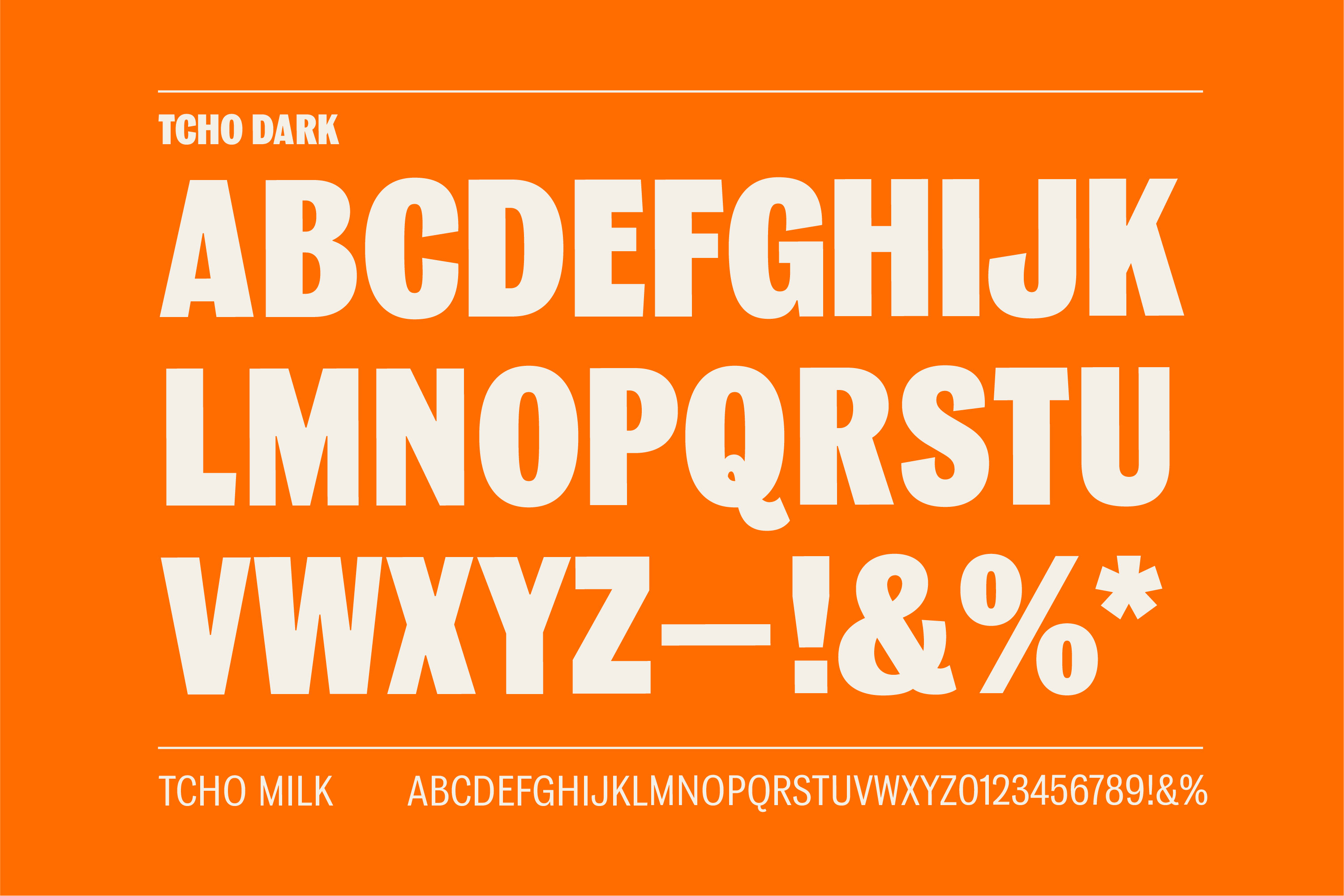
We rebuilt the brand from the ground up with an emphasis on breaking through the clutter of craft chocolate and reestablishing TCHO as a pioneer in premium chocolate. From bright colors and playful, plainspoken language to custom crafted type and a photo direction we dubbed “Flavor Lust” the new TCHO brings exploration and joy to the premium chocolate category. Our work also entailed a website overhaul for desktop and mobile.
.
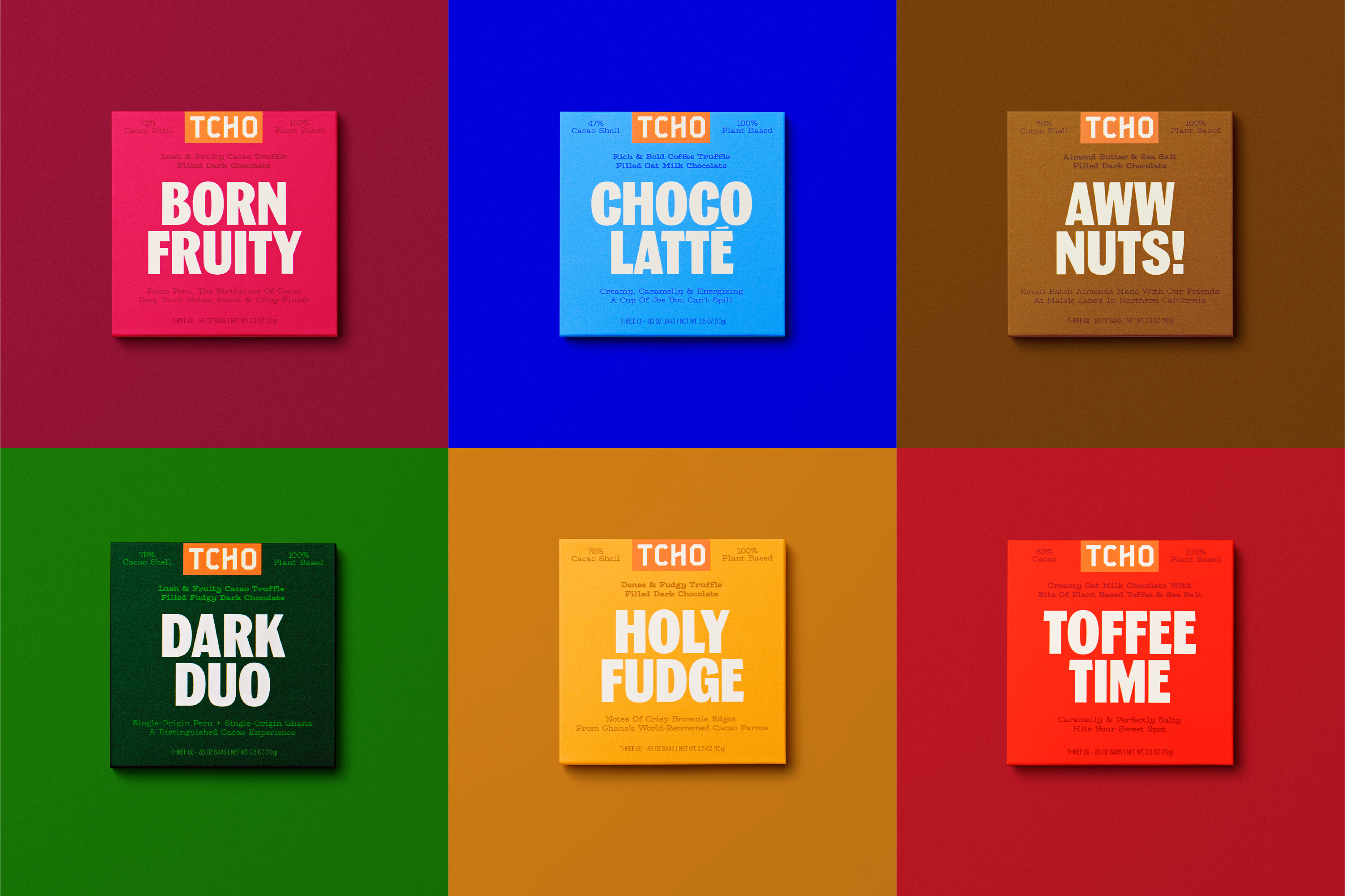


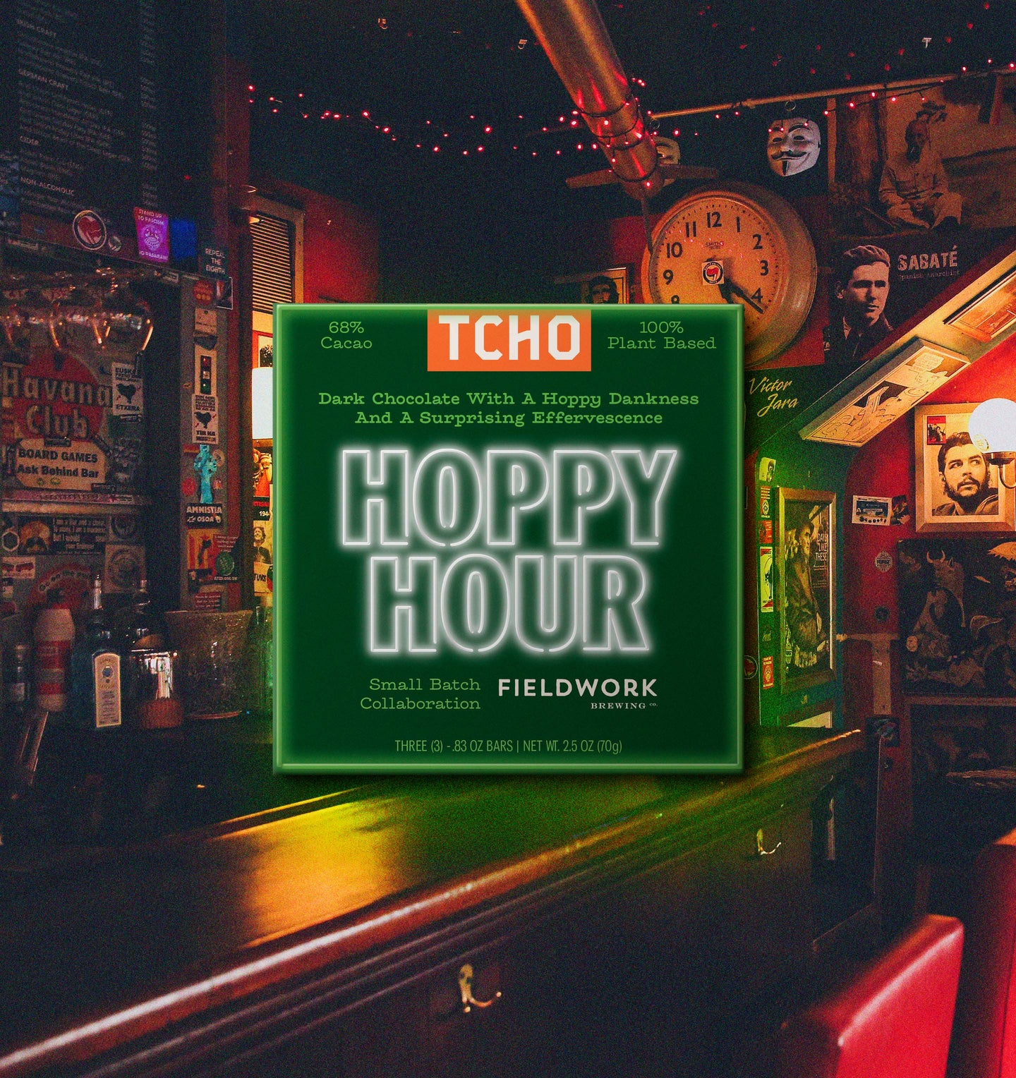
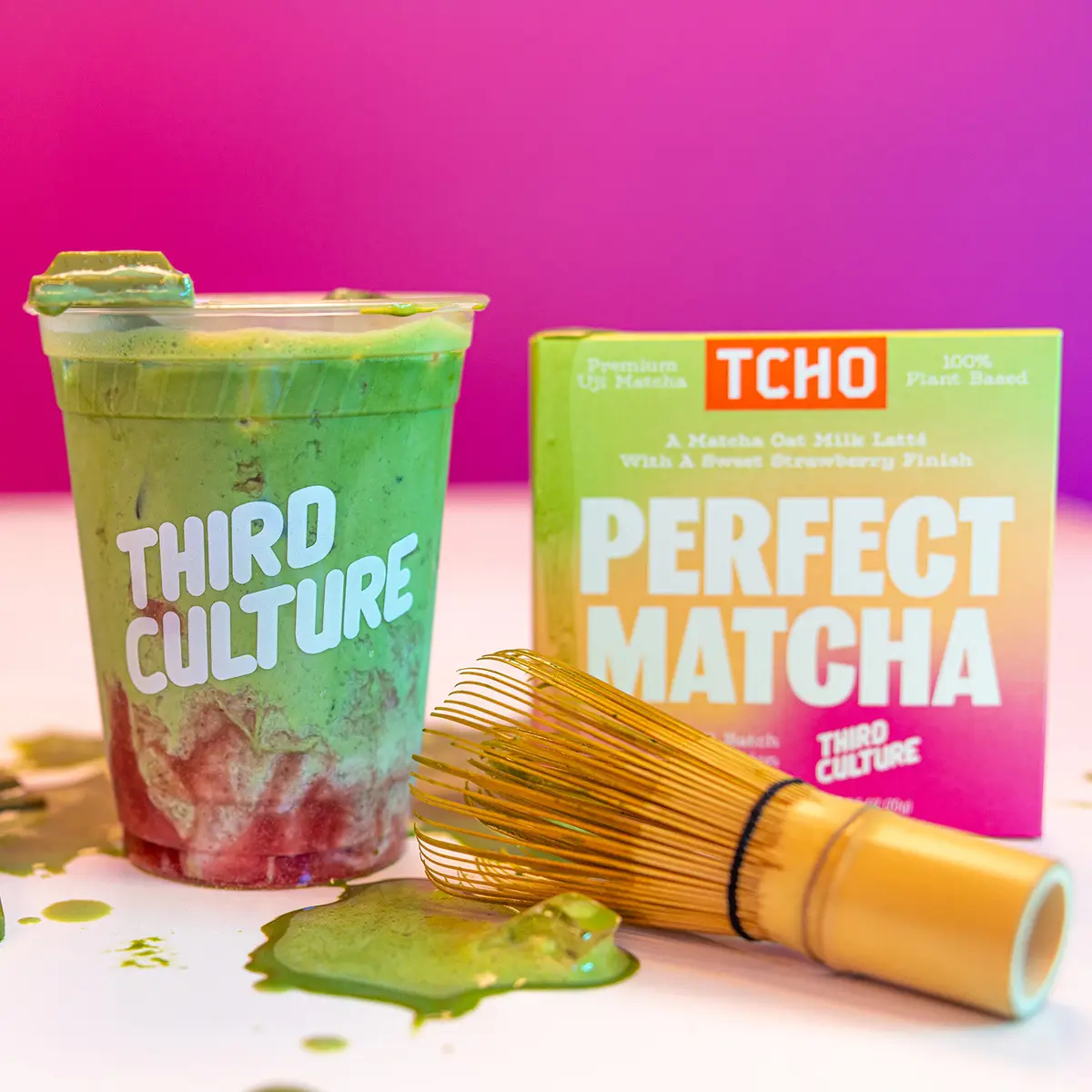
Collab Bars:
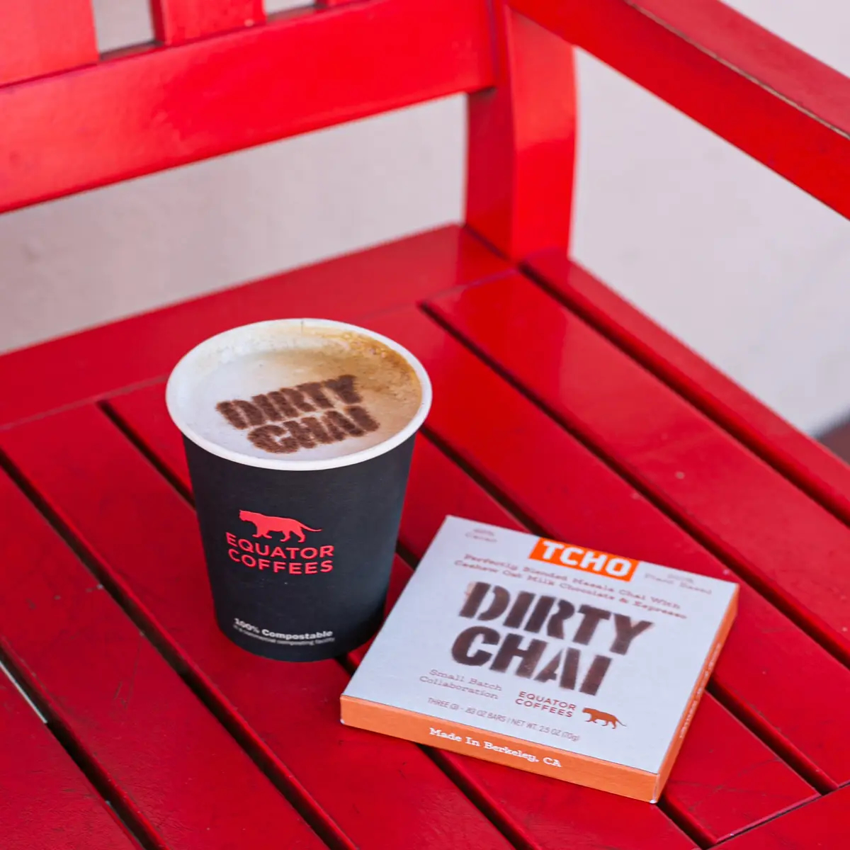
To keep things fresh in the year after the rebrand, TCHO has launched a series of collab bars with other Bay Area brands: “Hoppy Hour” with Fieldworks Brewing which also included a dark chocolate stout called “Bar Hoppin’”, “Perfect Matcha” with Third Culture, and “Dirty Chai” with Equator Coffees.


Cause Related Bars:
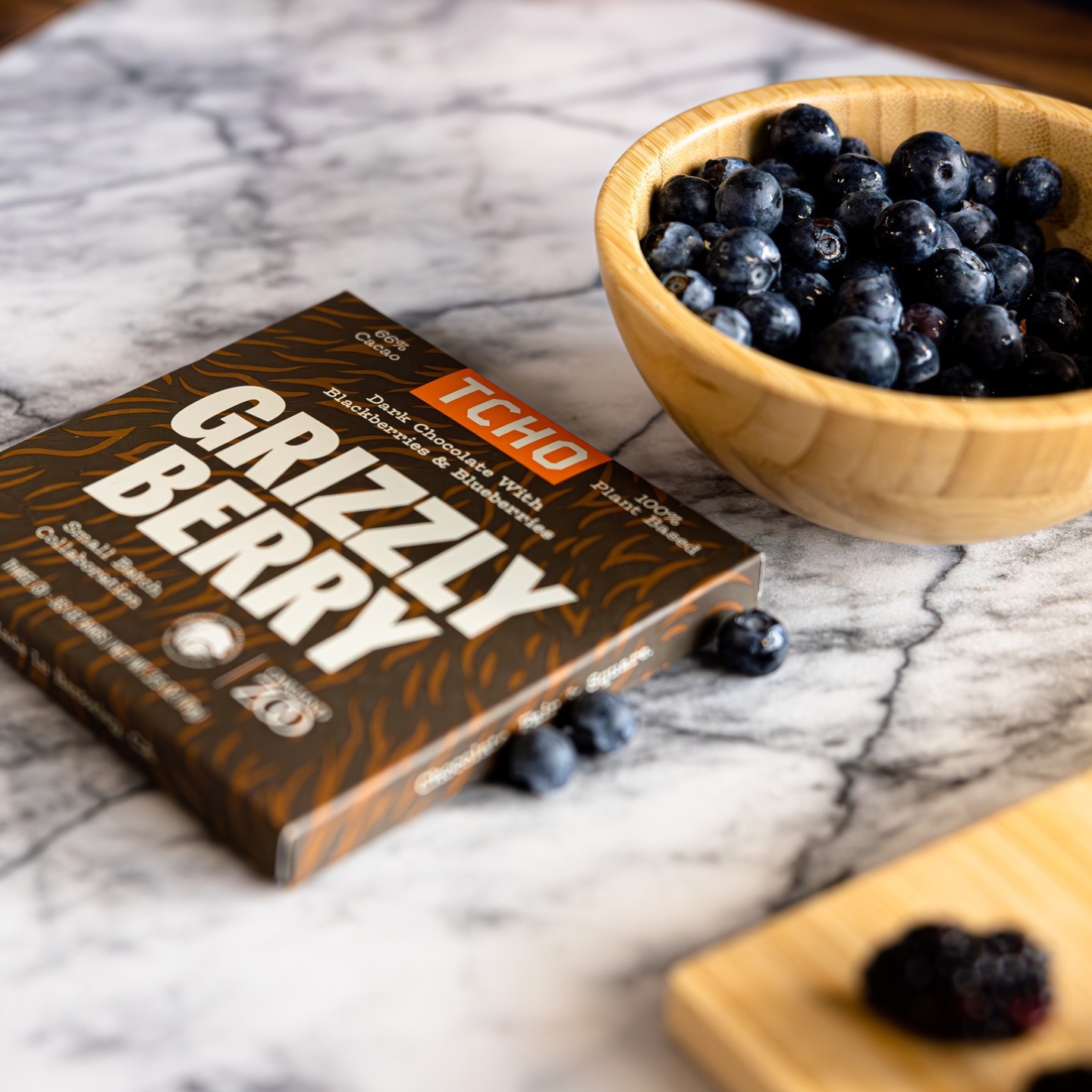
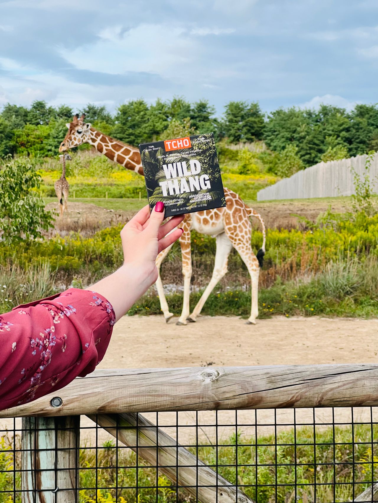
A series of cause-related bars with 10% of sales proceeds being donated to various organizations, including “Grizzly Berry” in partnership with the Oakland Zoo, “Deep Dark & Salty” with the Monterey Bay Aquarium, and “Wild Thang” in partnership with AZA (Association of Zoos & Aquariums).


New Flavors & LTO Bars:
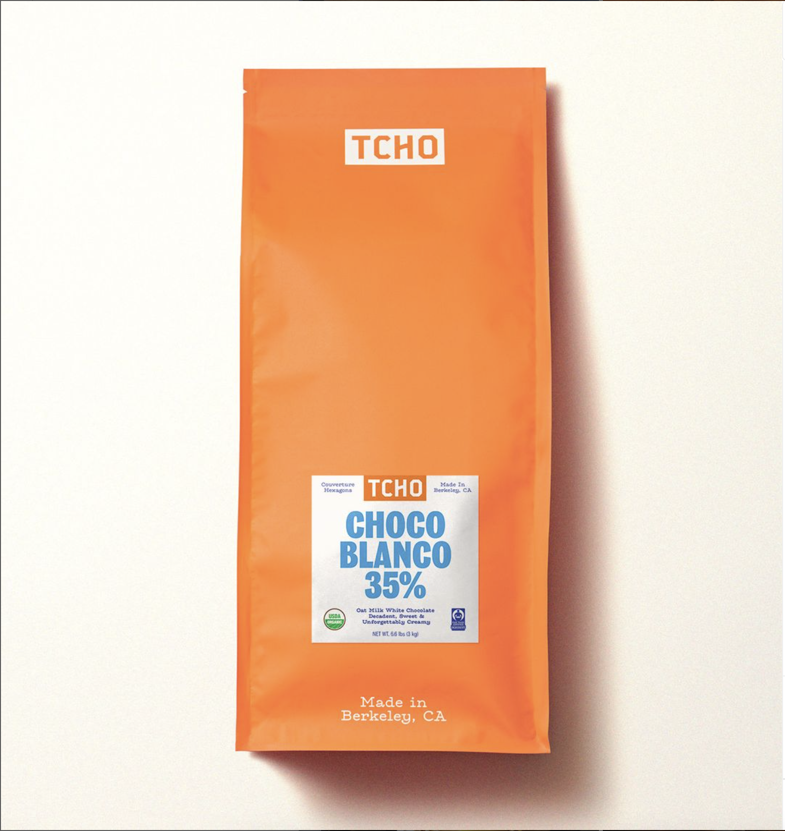
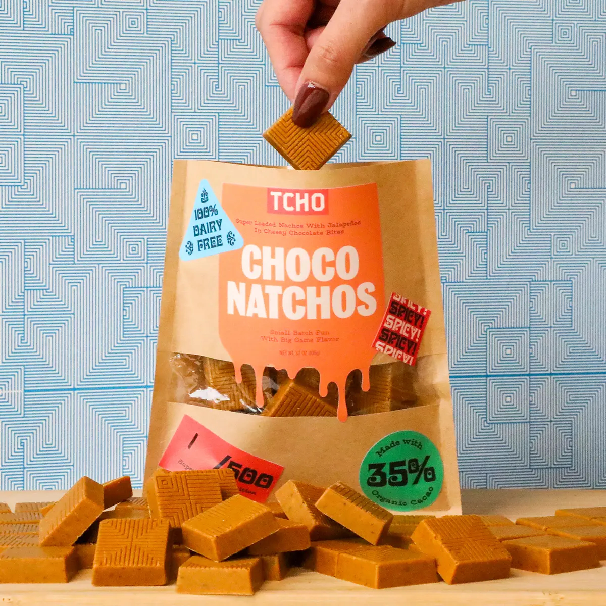
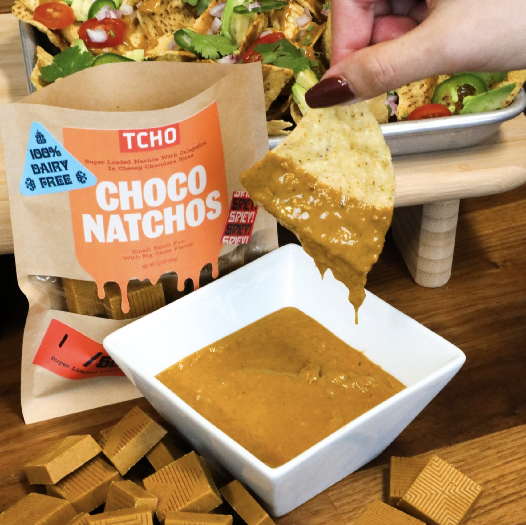
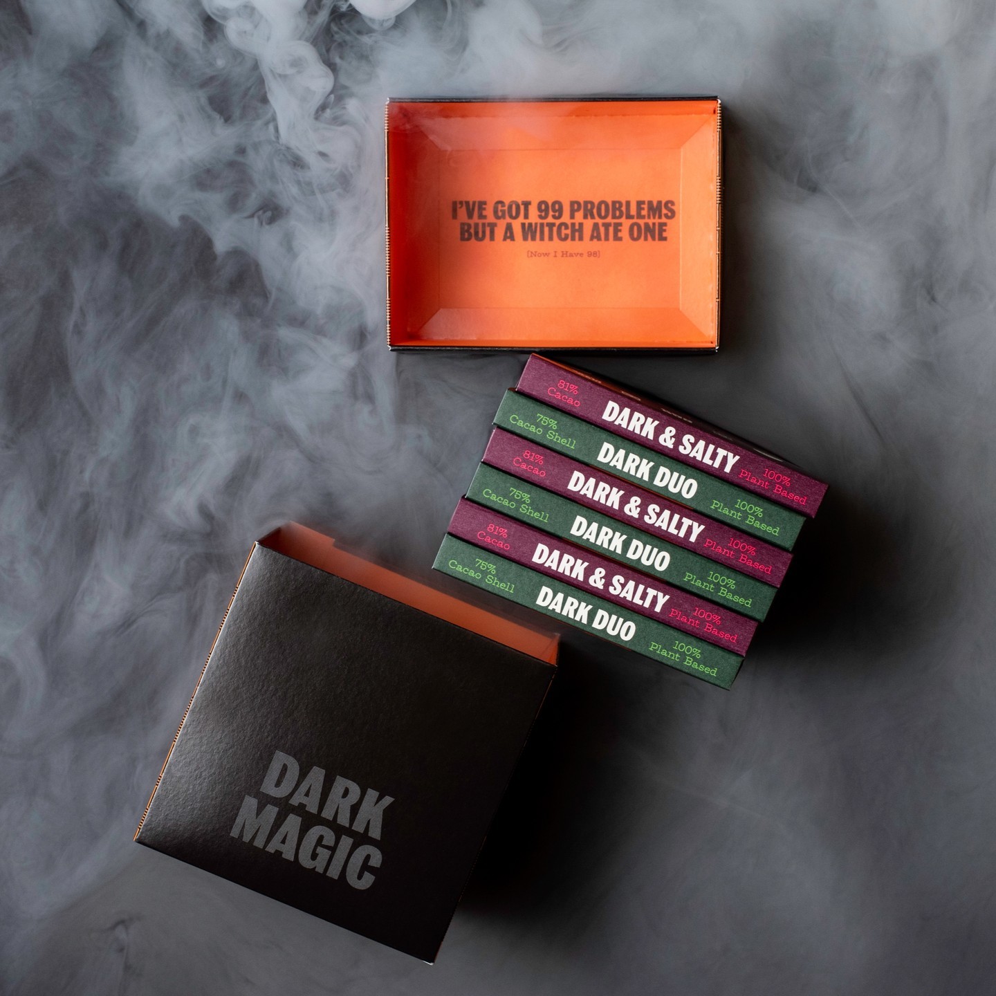
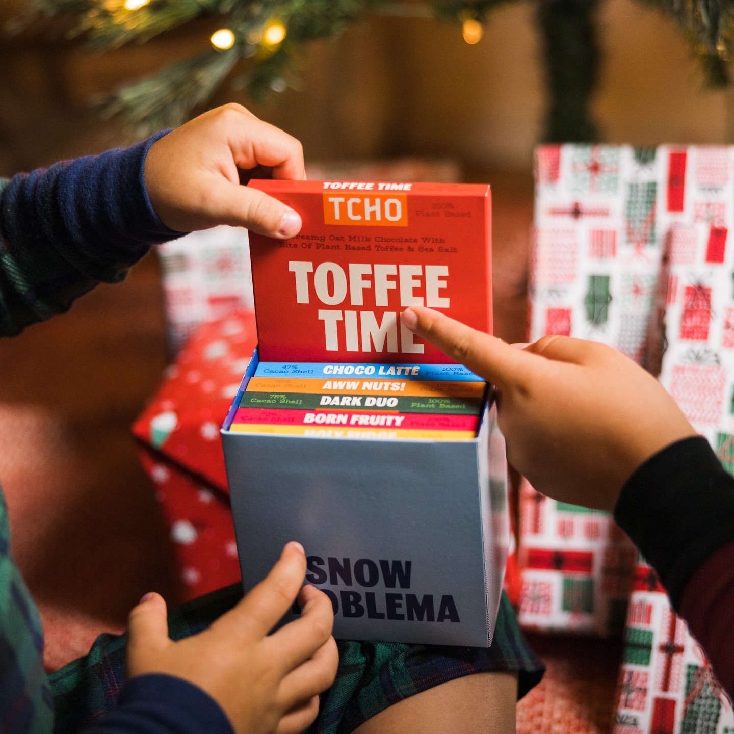
“Oat My Gawd” TCHO’s first oat milk chocolate bar, “Choco Blanco” their first white chocolate bar, “Dark & Salty” a Pink Himalayan Salt bar, “Choco Natcho” a nacho flavored bar / PR stunt for the Super Bowl, and a LTO variety packs for various holidays: “Sweet Thang” (Valentine’s Day), “Dark Magic” for Halloween, and “Snow Problema” for the winter holidays.


Press:
Veg News: “Chocolate Brand TCHO Shows Dairy Is Unneccessary: Goes Vegan, Wins Awards, Slashes Emissions” - Article
Nexty Awards “Best New Sweet Snack or Dessert” - Link
Making of “Deep, Dark, & Salty” Colab Bar with Monteray Aquaium - Link
2023 International Chocolate Awards (Americas) - “Perfect Matcha” Gold Winner & “Choco Latté” Silver Winner
Team: